branding / noma
In Fall 2024 Noma asked me to help her with the branding of her new business. She decided to open her own psychotherapy practice. Her briefing was straight forward, she wanted something that combines her origins and cultural heritage from south africa and her second home styria. This duality should be shown in every aspect of the branding.
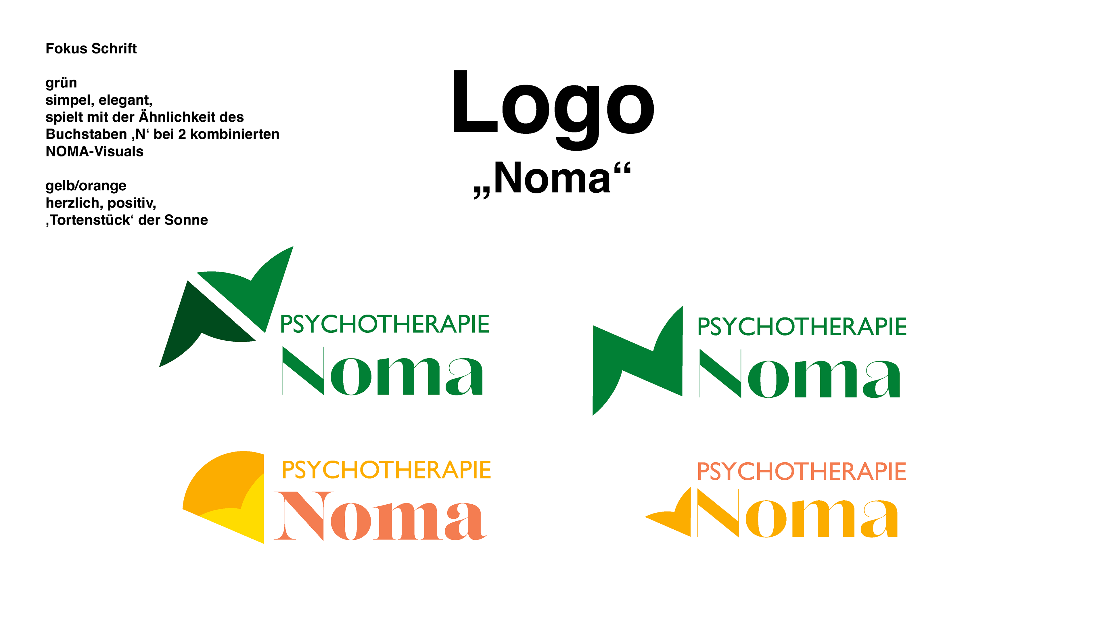
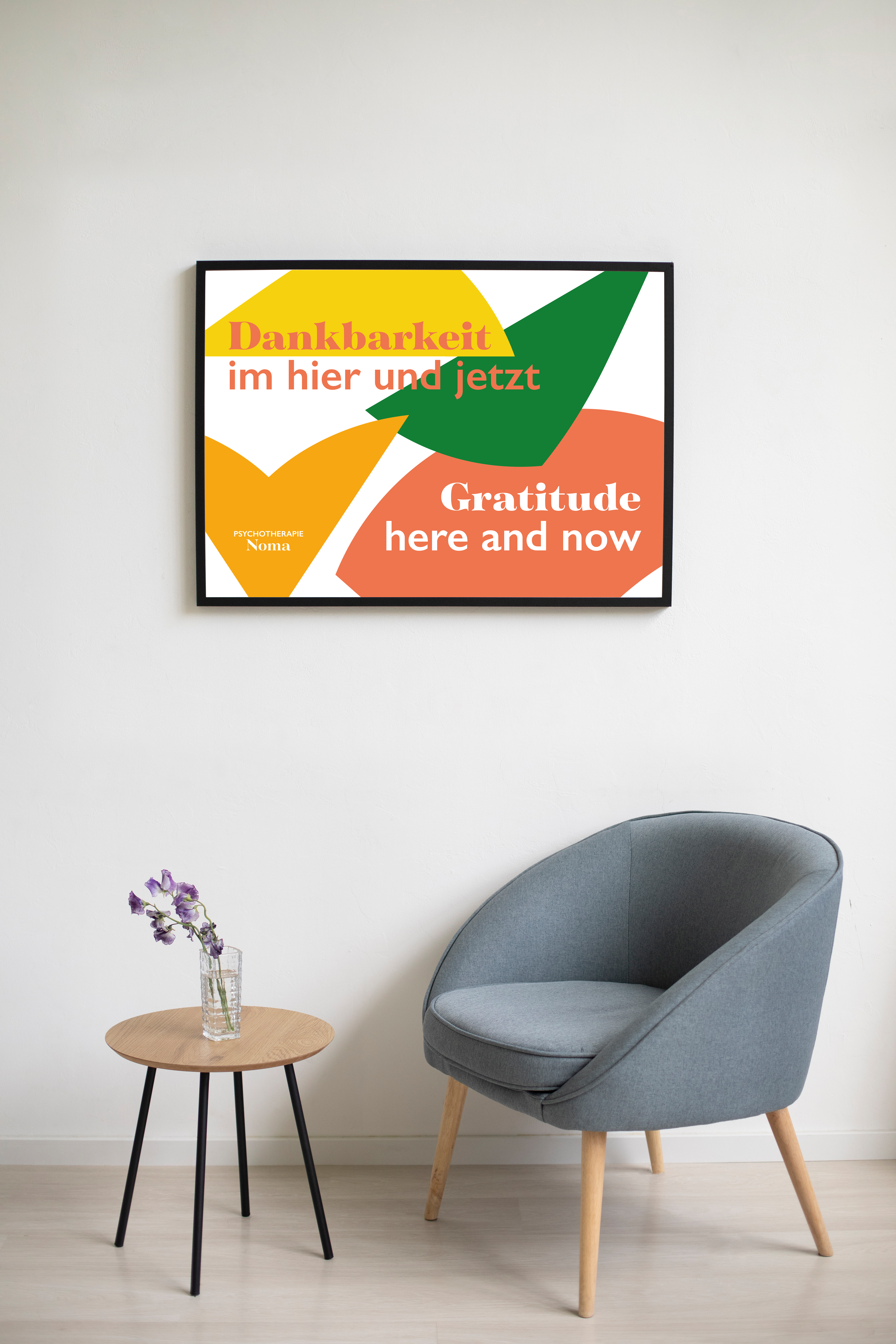
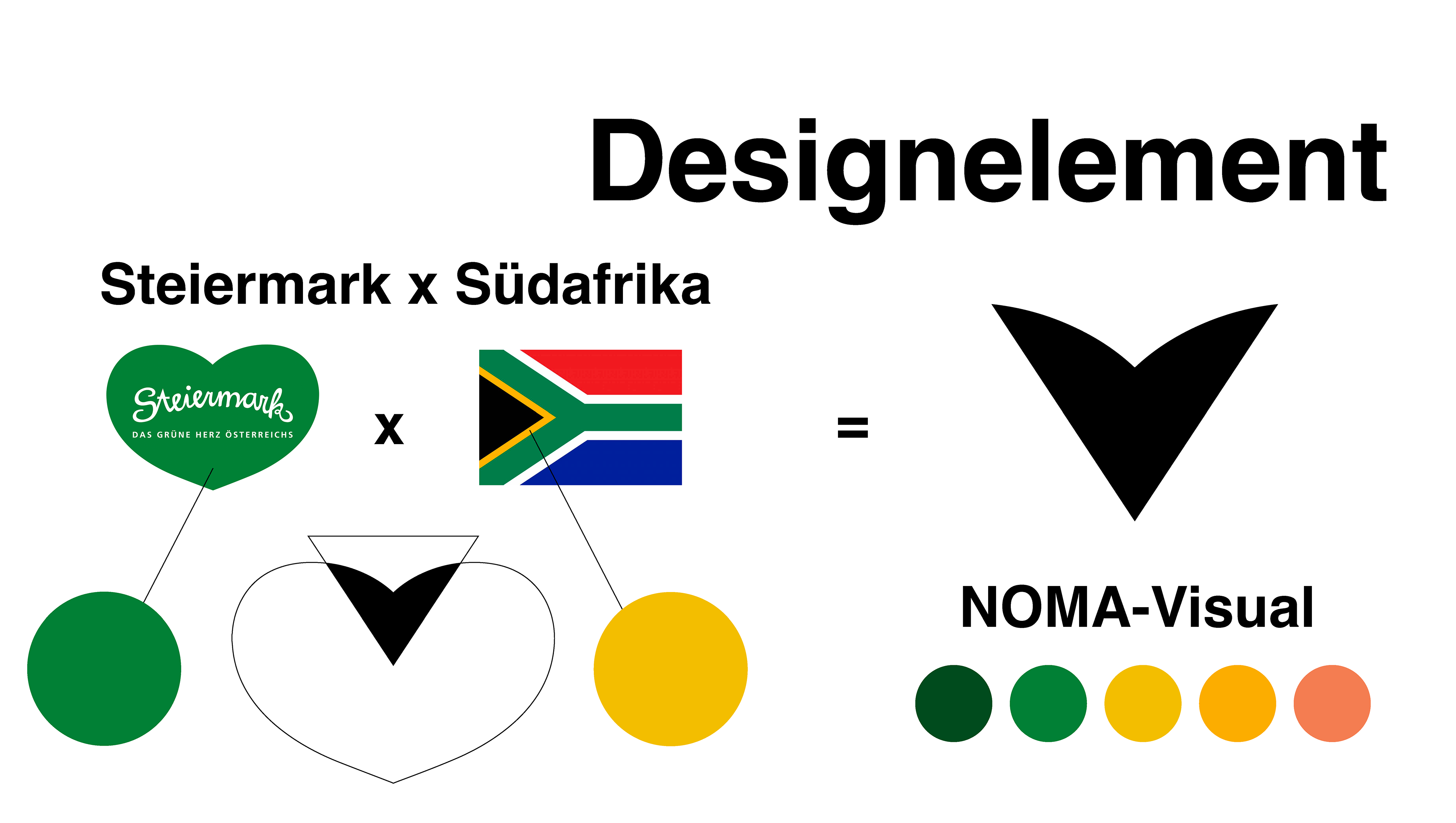
For the branding, I decided to bring in elements from south africa and styria and find a way to combine it. In this design process the abstract heart shape was found, which built the base of the following branding. Colorwise the green of styria and yellow from south africa where brought together by the broad term of 'nature' and developed into a spectrum of colors for 'a sunrise in nature'.
For the branding, I decided to bring in elements from south africa and styria and find a way to combine it. In this design process the abstract heart shape was found, which built the base of the following branding. Colorwise the green of styria and yellow from south africa where brought together by the broad term of 'nature' and developed into a spectrum of colors for 'a sunrise in nature'.
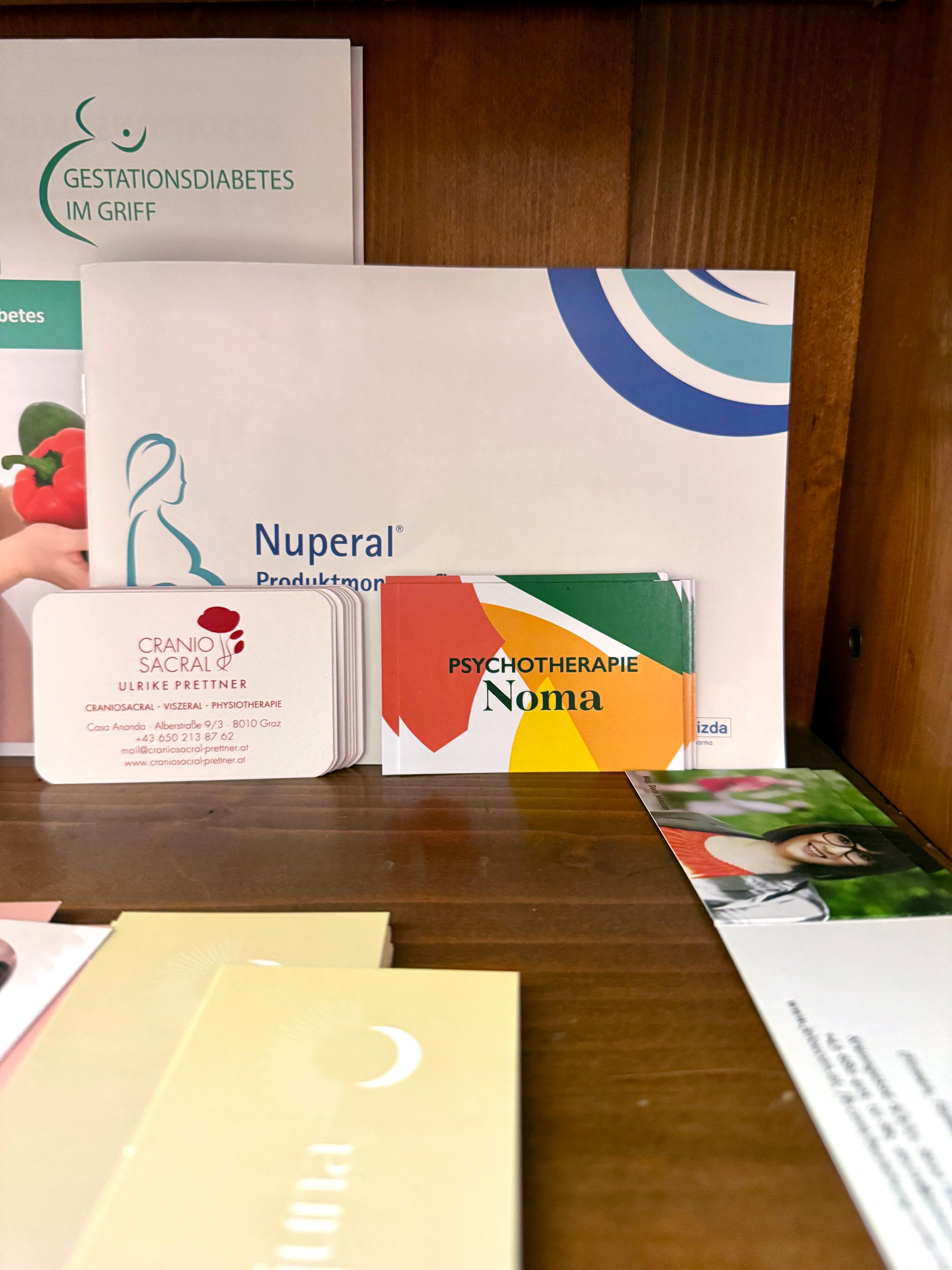
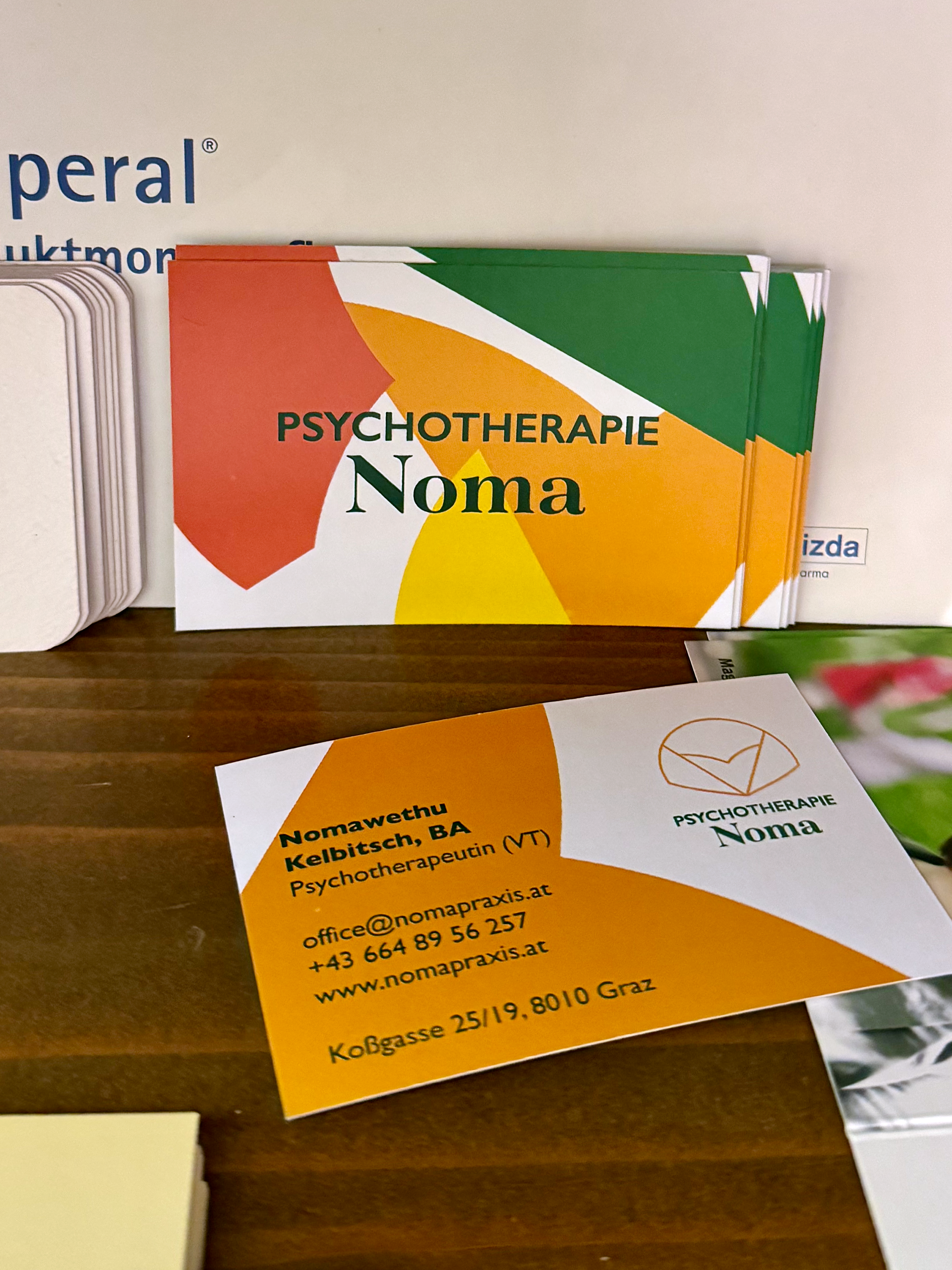
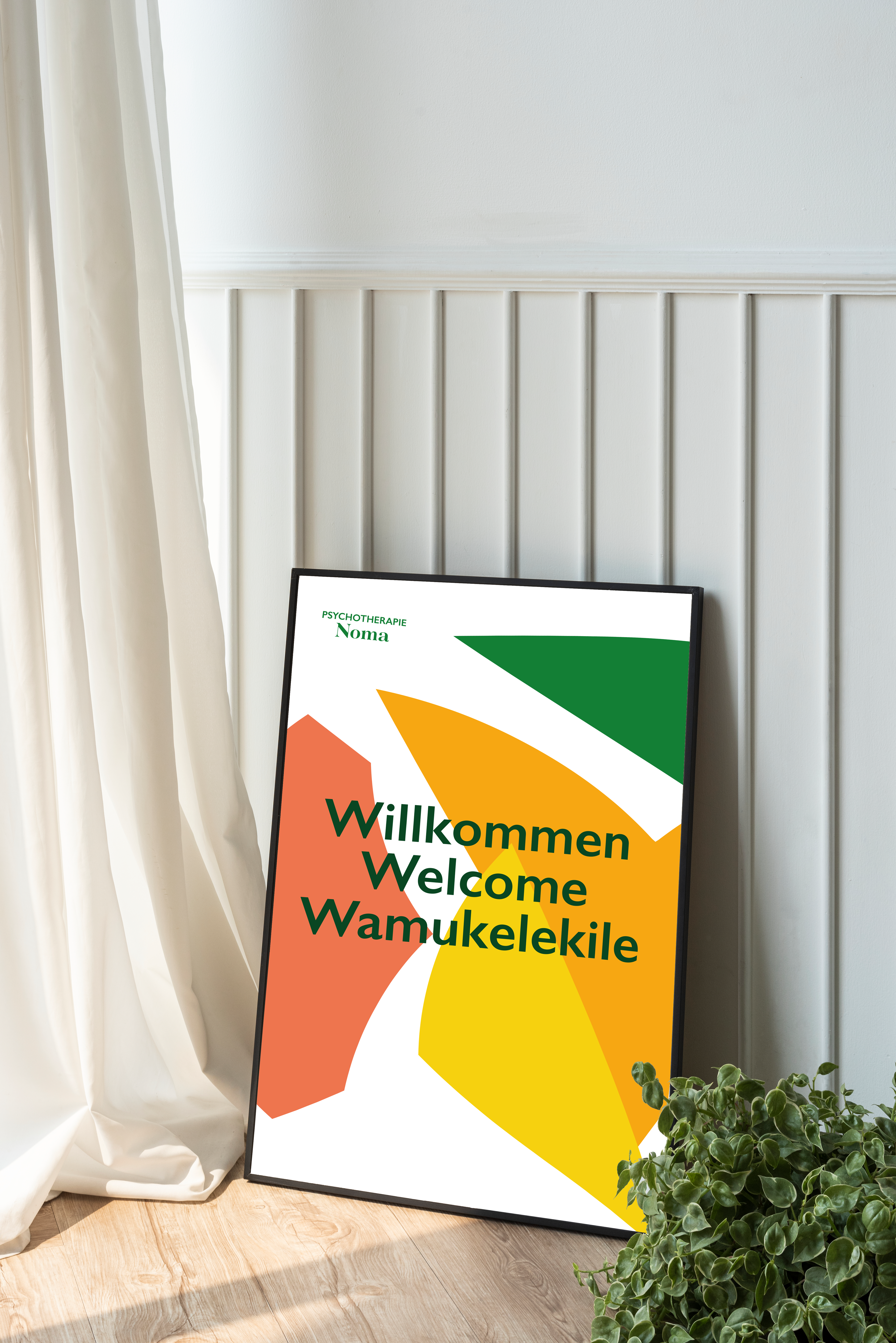
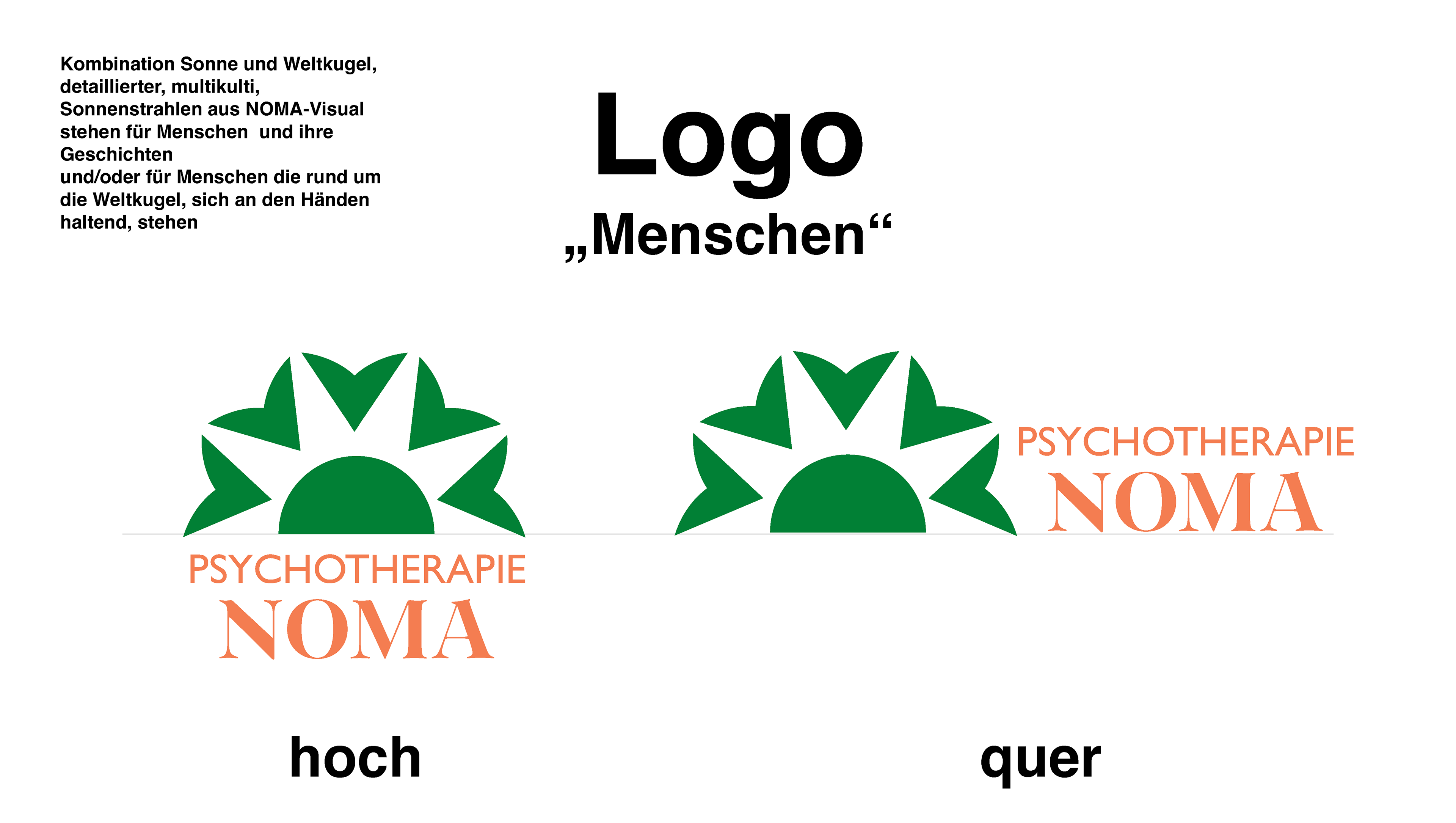
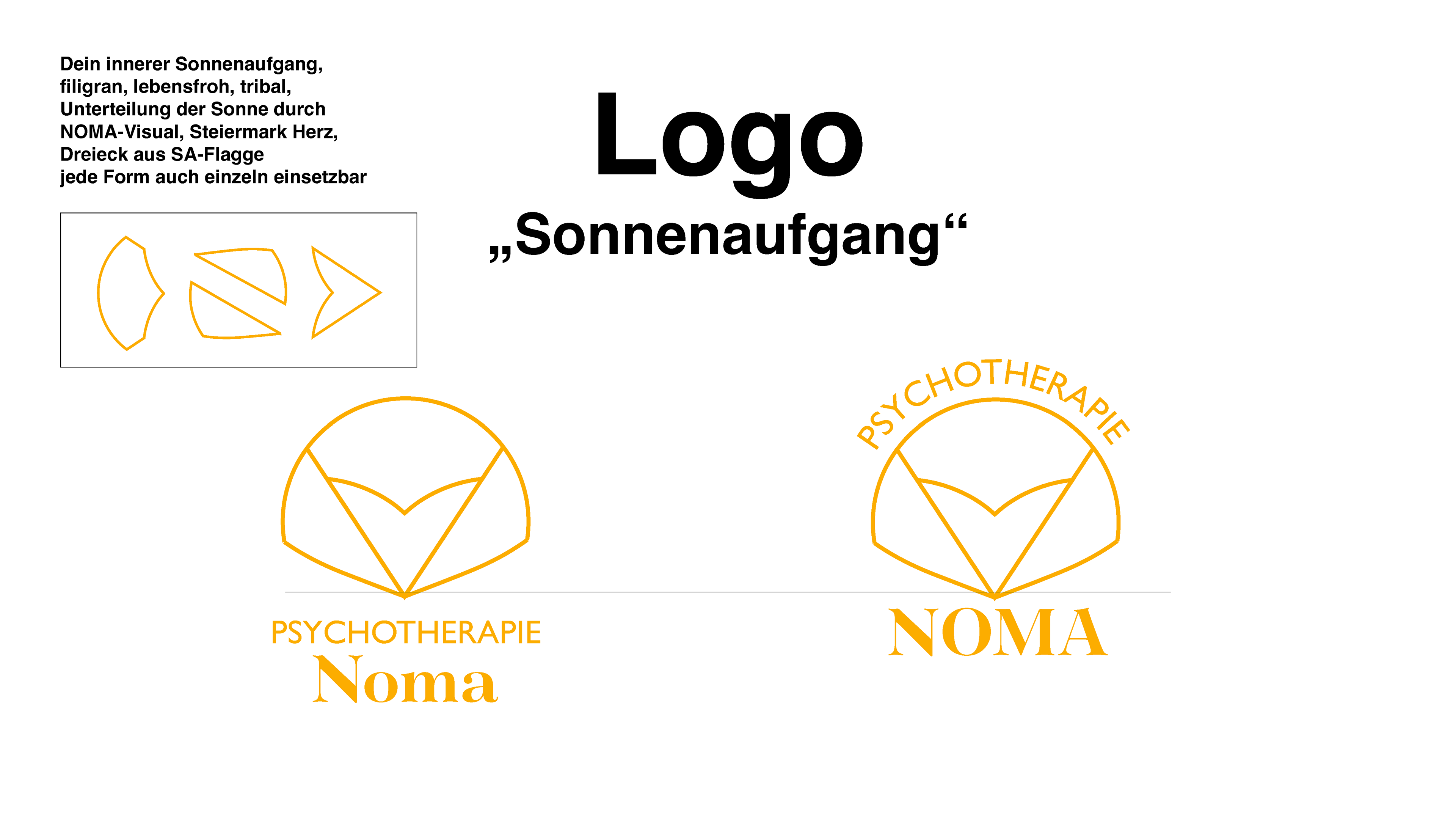
Out of three design proposals she chose the Theme 'Sonnenaufgang' with slight color adjustments. This Logo also offered more design elements which were taken advantage of in following print products like business cards and posters. These elements also work for an elaborate social media presecence with big recognition factor.
Psychotherapie Noma
Fall 2024
Step 1: debriefing
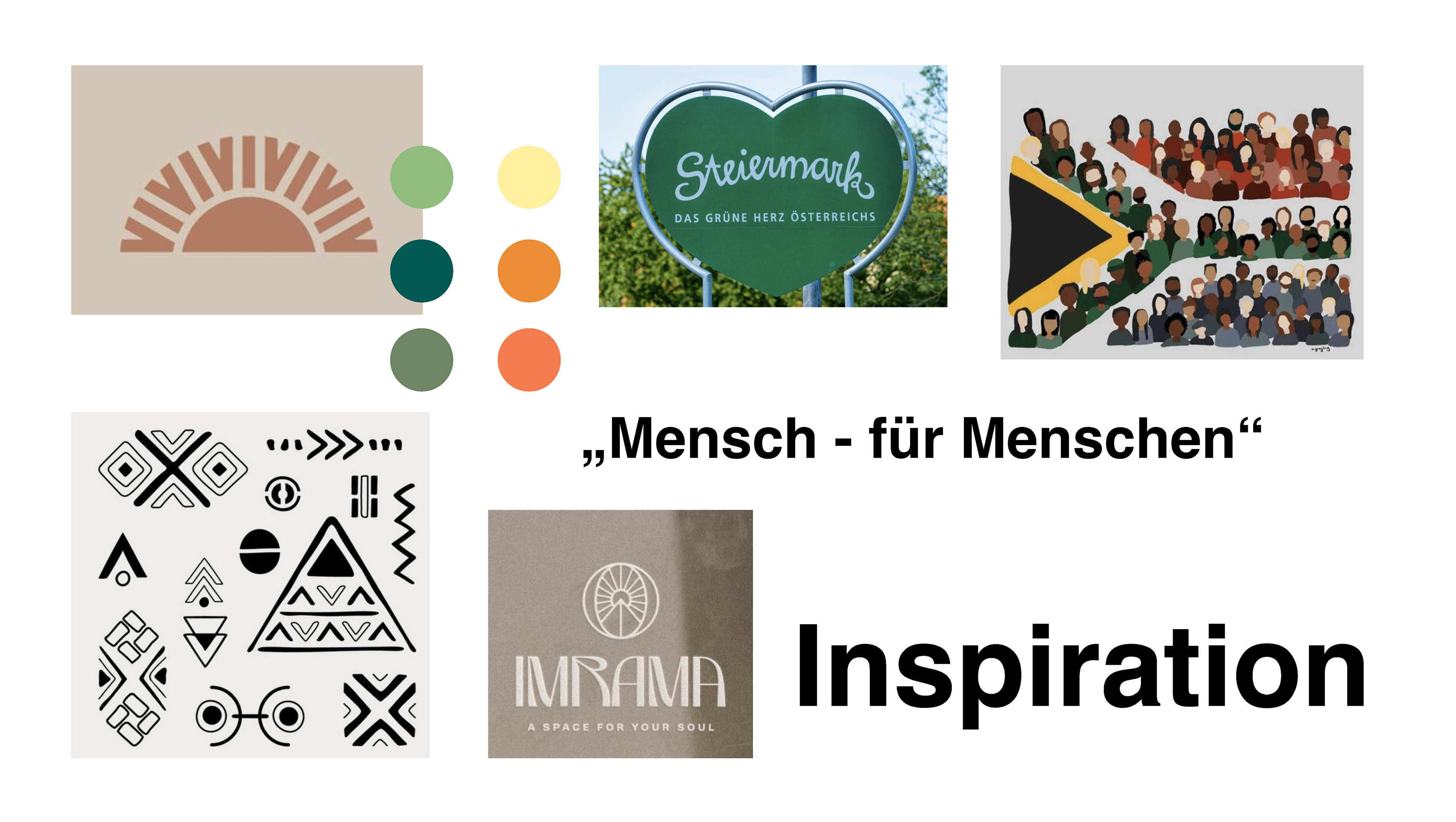
Step 2: researching, gathering inspiration
Step 3: build a concept