typeface / beyond-e
In our second typography lecture we worked in pairs and were asked to do a typeface based on a few letters found somewhere in the city/ streets. For this Project I worked with my dear colleague Emma Jongsma. She photographed a truck on the Highway with the letter „e“ on the backside. That was our only letter and starting point to come up with the concept for the type. After analyzing the letter and deciding on our structure, each of us drafted the alphabet and numbers zero to ten. We then combined and refined our ideas to the final font named „beyond-e“. We digitalized our drafts firstly in Adobe Illustrator and then made an otf-file in Glyphs Mini. To showcase the font we had to design a poster as well as a booklet with our process. As our font name is beyond-e we wanted to incorporate that also into our booklet. So I came up with the idea of an additional slip case. In the beginning the viewer sees only the „e“ and then has to go „beyond“ the cover to reveal our booklet.
FH Lecture
Typography 2
Summer 2020
Typography 2
Summer 2020
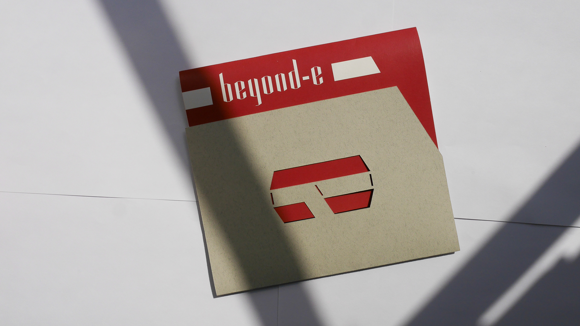
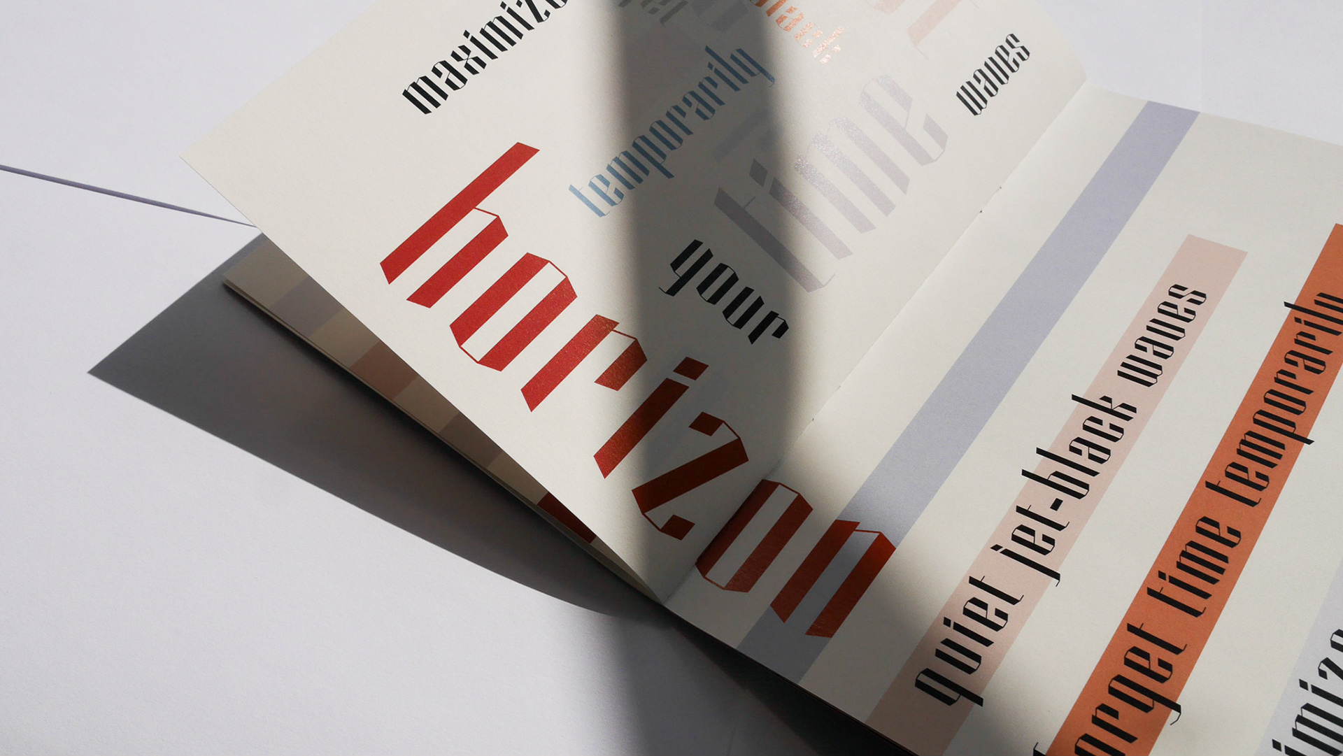
photo credits: https://emma-jongsma.com